Lighting Effect
In this tutorial, I will show you how so improve boring text with some simple lighting. I used GIMP to produce this effect.

Lighting Effect
In this tutorial, I will give you a step-by-step guide on how to create an awesome motion blur like background with text, all done in GIMP It’s easy to make and looks awesome!
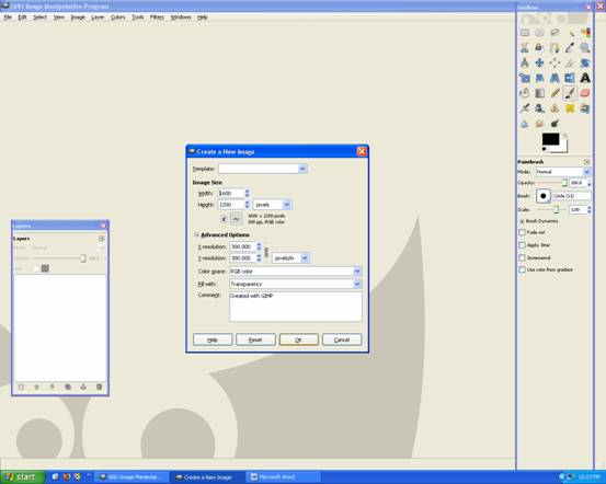
Begin by opening up Gimp –> making a 1600 x 1200 with 300dpi page and its transparency.
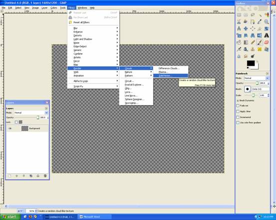
Now go Filters–>Render–>Clouds–>Solid Noise
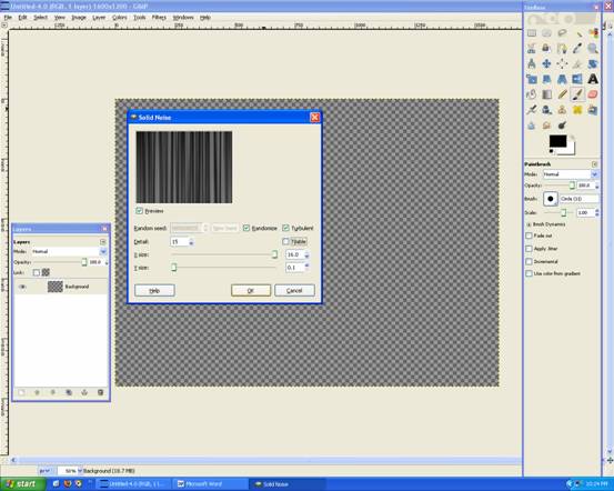
Settings are: Detail:15, X:16, Y:0.1, Turbulent and Randomize
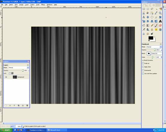
It should look like this:
Then go to Filters –> Distorts –> Polar Coordinates
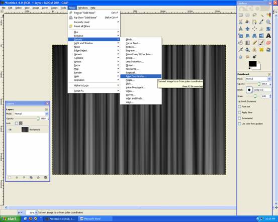
And set it to Both 0 and 0
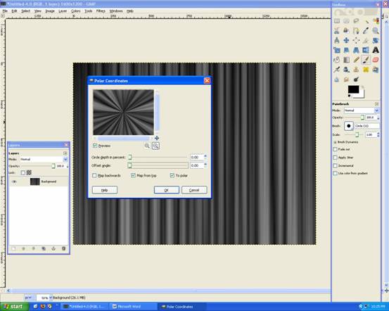
Should look like this:
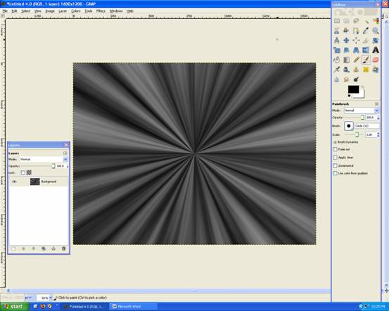
Grab the Gradient tool White FG only
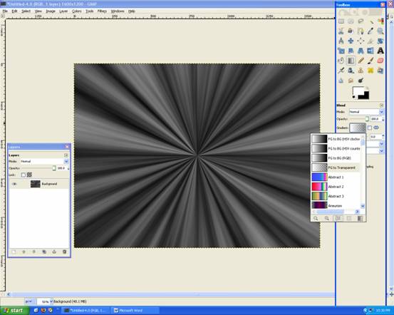
Apply the gradient like below:
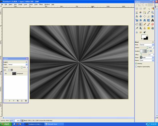
Should look like this:

Now repeat that step!
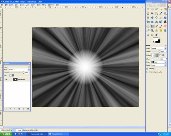
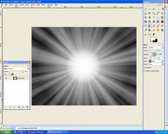
And then increase the length of the gradient outwards (like below):

Should look like this:
Create a new layer Name: Colour, and make it Transparency
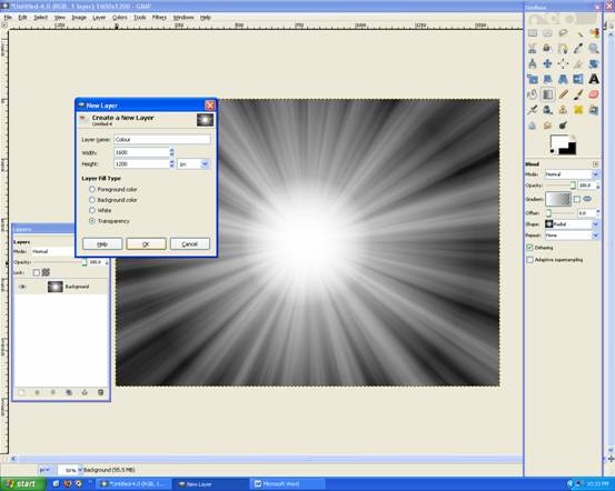
Now grab the Gradient Tool Set it to the following settings as shown below:
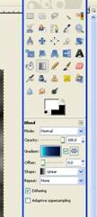
Apply Gradient Tool like below:
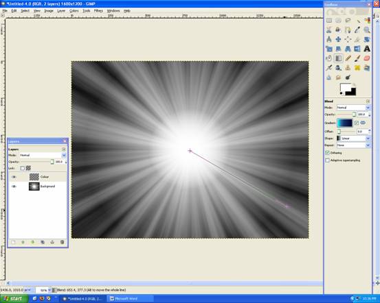
Should look like this now, and set the layer to OVERLAY:
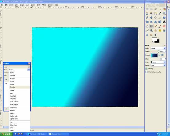
We have some colour now!
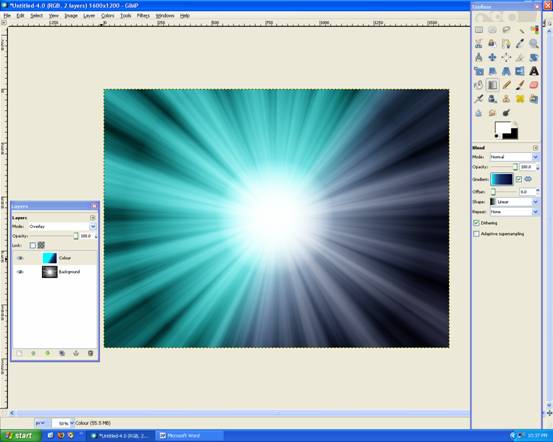
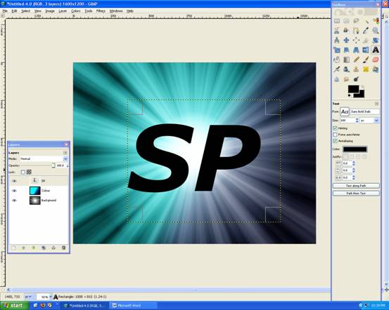
Now add your text, with the settings below:
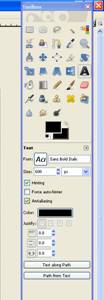
Like this:
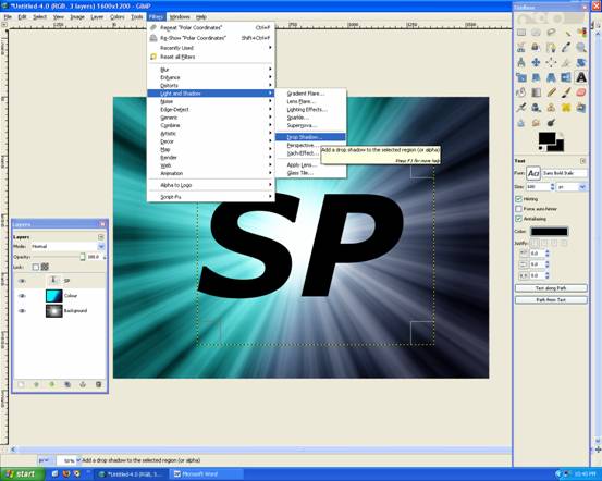
Then go Filters –> Light and Shadows –> Drop Shadow
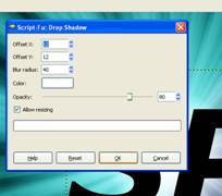
Set it to the following settings: 12, 12, 40, White , Opacity:80
Looks like this, with a nice white shadow!
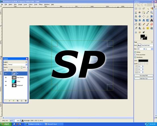
Now while on the text layer, use the Eclipse Tool and draw something like below:
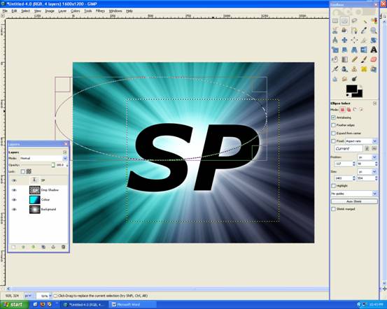
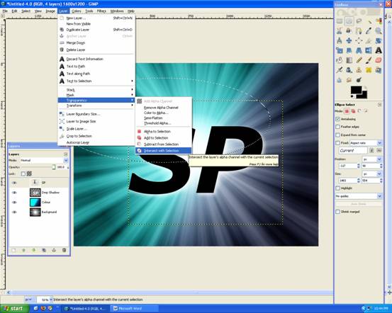
Then go Layer –> Transperency –> Intersect with Selection
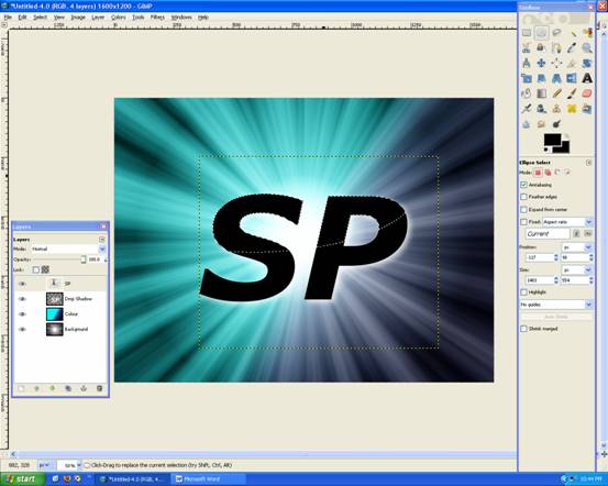
You now have a selection like this:
Grab the Gradient Tool with the following settings:

Apply the Gradient like below:

Now it looks like this, Deselect everything (Ctrl + Shift + A).
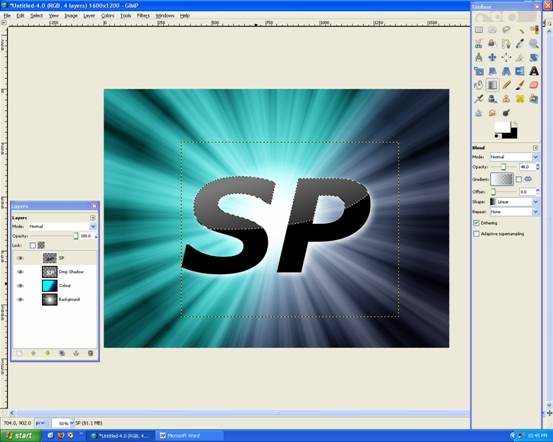
Merge that Layer Down

And then Duplicate
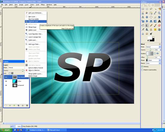
Then Rotate it 180degrees (Layer –> Transform –> Rotate 180)And Flip it the other way (Shift + F) Like this:
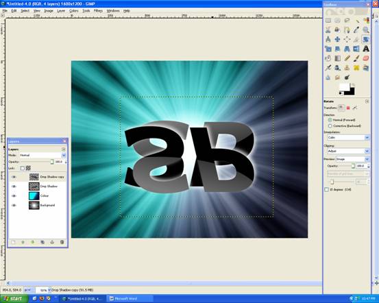
Then move it up so there is only a slight gap, like below:
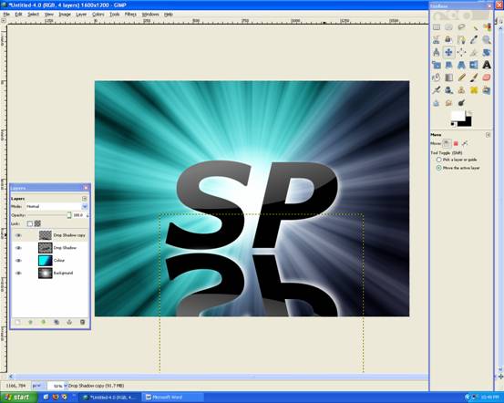
Now go Layer –> Mask –> Add Layer Mask
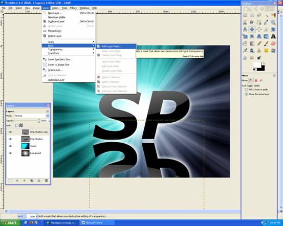
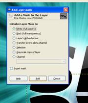
Choose WHITE (Full Opacity)
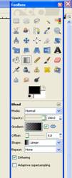
Now grab The Gradient Tool and set it to FG Only: Black , with 100% Opacity
Apply Gradient like below:
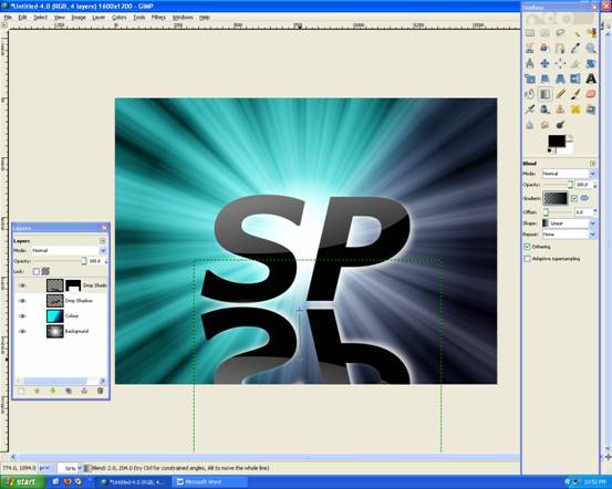
You get a nice fading reflection!
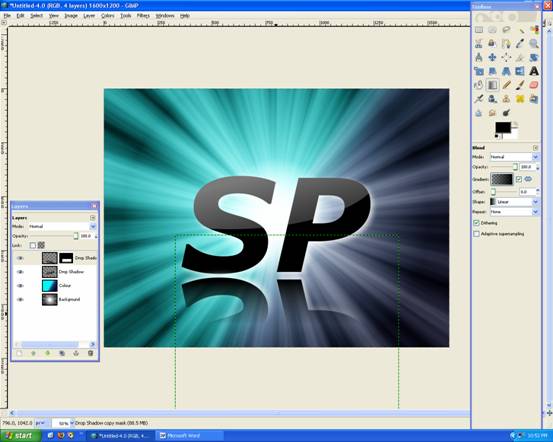
Now create a new Layer: Flare
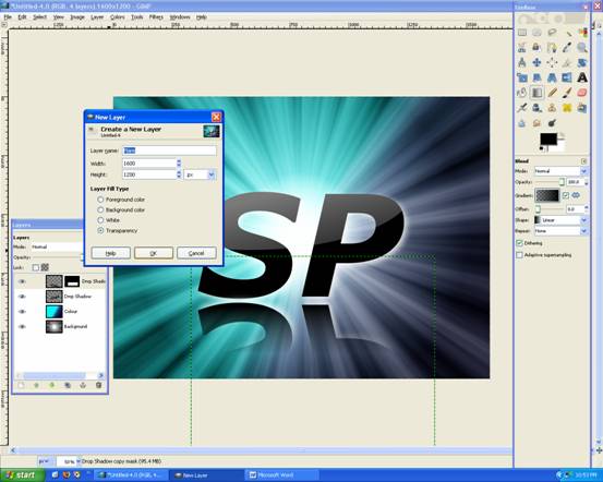
Rember the Coordiante of where you’d like the Lens Flare: mine is 420, 470:

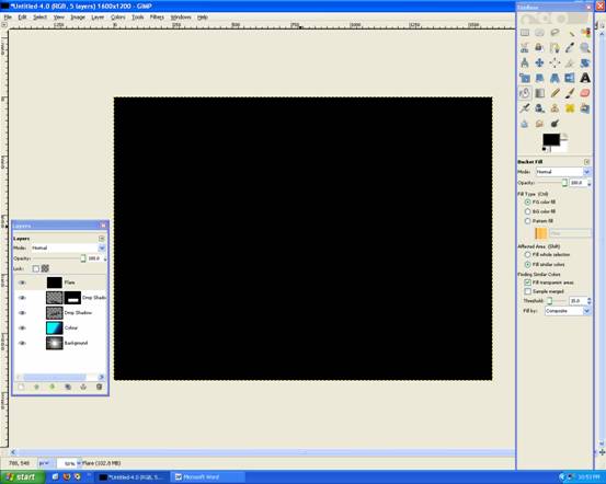
And now Fill the Layer with Black
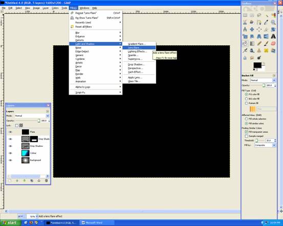
Now go to: Filters –> Light and Shadows –> Lens Flare
Enter your Cooridinates: X:420 Y:470
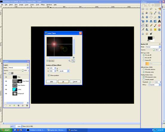
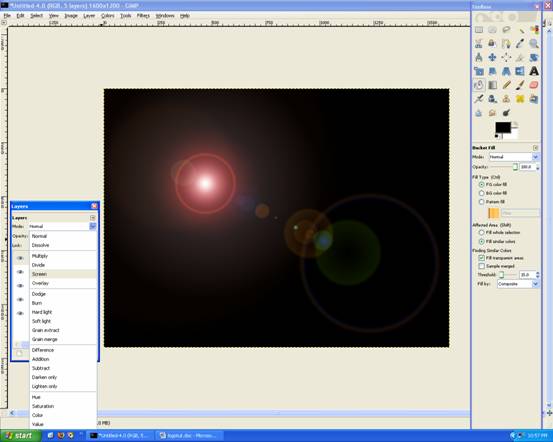
This may take awhile, but will look like this, Then change the Flare layer to SCREEN:
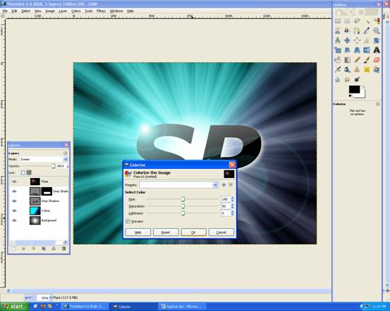
You may colorize this layer Color –> Colorize and change the HUE to whatever, I did Blue:
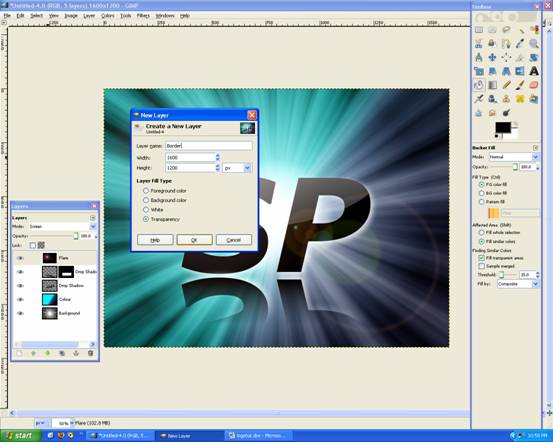
Make a new Layer: Name: Border and Transparency.
Grab the Gradient Tool and with the following settings:
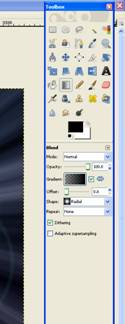
Apply gradient like this (below):
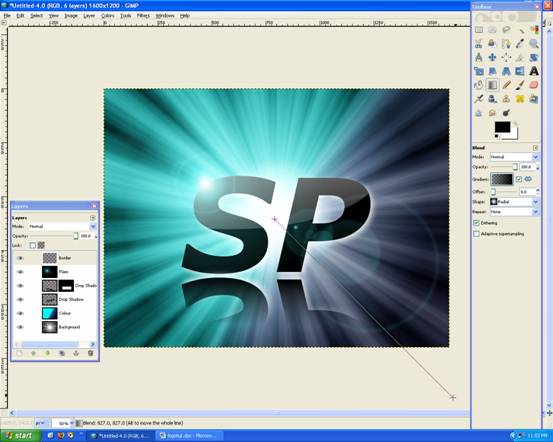
Looks like this:
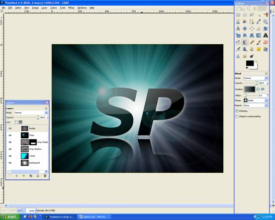
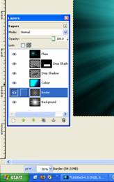
You may move the Layer down, to just 2nd last (above the Background Layer)
You’re finished!
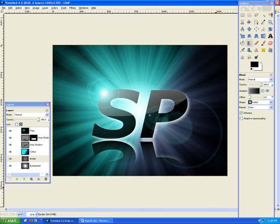
I hope you like it, please comment and Rate!


Deprecated: Function get_users_of_blog is deprecated since version 3.1.0! Use get_users() instead. in /home/scottp12/public_html/wp-includes/functions.php on line 6121
Thanks for the feedback, I’ll be updating some of the images very soon! :)
Deprecated: Function get_users_of_blog is deprecated since version 3.1.0! Use get_users() instead. in /home/scottp12/public_html/wp-includes/functions.php on line 6121
I liked it alot and it was very helpful. However, such a shame that the gradient tool pictures are bad quality because chaning gradient from linear to radial can be easily missed. Also I would suggest colorizing last and create a new layer because if you colourise on the layer of the flare you can’t change the position of the flare without making it look dodgy.
Nevertheless Great Turorial! :)